
Bring Your Brand Into the WordPress Block Editor
The WordPress Block Editor is no longer just a content tool — it’s a design canvas. With block patterns, theme.json configuration, and reusable block styles, you can build a cohesive design system that lives inside the editor, ensuring every page maintains brand consistency without developer intervention. Here’s the step-by-step approach.
Layer One: Define Design Tokens in theme.json
Even if you’re not using Full Site Editing, a well-structured theme.json file serves as your single source of truth for design tokens. Define your color palette under settings.color.palette, font sizes under settings.typography.fontSizes, and spacing scale under settings.spacing.spacingScale. These tokens flow into the editor’s controls, so content creators pick from approved values rather than eye-dropping arbitrary hex codes.
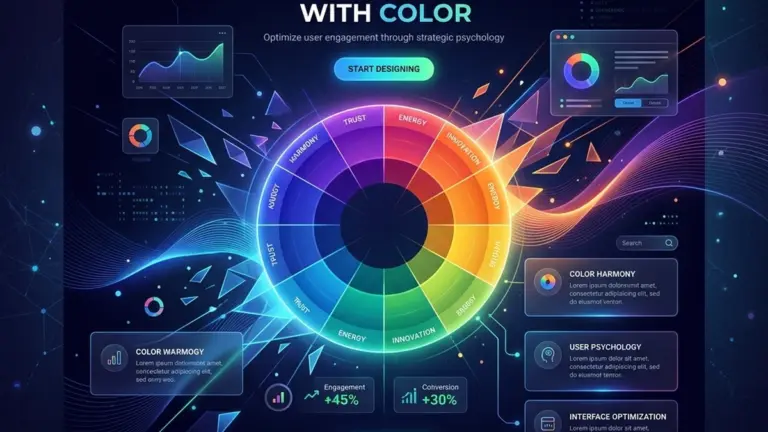
For a SaaS-focused WordPress theme, limit the color palette to 6–8 swatches: primary, secondary, accent, neutral light, neutral dark, and surface. This constraint sounds limiting, but it prevents the visual chaos of pages that use 12 different blues because someone couldn’t find the right one in the picker.
Layer Two: Build Reusable Block Patterns
Block patterns are pre-built layouts that users insert with one click. Instead of leaving content creators to assemble hero sections, pricing tables, and feature grids from scratch, provide patterns that match your brand’s design language. Register patterns in PHP using register_block_pattern() and namespace them with your theme slug.
Each pattern should include placeholder content that makes the layout’s purpose obvious — real-looking headlines and body copy, not lorem ipsum. For a hero pattern, include a heading block, a paragraph block, a buttons block with primary and secondary CTAs, and an image placeholder. The key is making the pattern immediately functional after insertion, with the user only needing to swap the copy and imagery.
Layer Three: Register Block Styles
Core blocks ship with default styles, but you can extend them with register_block_style(). A “Card” style for the Group block adds padding, a border radius, and a subtle box-shadow. A “Lead” style for the Paragraph block increases font size and line height for introductory text. These styles appear in the block sidebar, making them discoverable without cluttering the toolbar.
Use wp_enqueue_block_style() to load these custom styles only when the block is present on the page — a performance win that avoids shipping unused CSS.
Layer Four: Lock It Down (Where It Matters)
Not every block needs to be freely editable. Use templateLock="all" on custom post type templates to prevent users from removing essential structural blocks while still allowing content editing within them. For reusable call-to-action sections, lock the container and buttons but leave the heading and paragraph open for copy changes. This gives content teams flexibility without risking a broken layout.
The goal is a design system that empowers content creators, not handcuffs them. When your block patterns, tokens, and styles work together, every page looks intentional — even the ones built by someone who’s never opened Figma.

0 Comments
Please log in to leave a comment.