Why Your CTA Color Matters More Than You Think
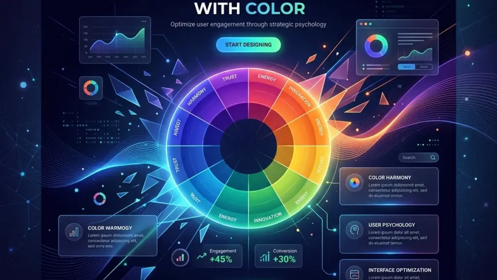
Color is the first thing users notice and the last thing they consciously think about. On SaaS landing pages, color choices operate below the surface of awareness, subtly shaping trust, urgency, and decision-making. Understanding the psychology behind these choices can transform a flat landing page into a conversion engine.
The Trust Colors: Blue and Green
Blue is the most common color in SaaS design for a reason: it’s universally associated with reliability, security, and professionalism. Think Stripe, PayPal, and LinkedIn — they all anchor their brand identity in blue. For a WordPress theme marketplace or any digital product platform, a strong primary blue signals that your platform is stable and trustworthy.
Green communicates growth, success, and safety. It’s the default choice for pricing tables (“Most Popular” badges, trial CTAs) and checkout confirmations. The psychological association with “go” and completion makes green the ideal color for conversion actions — but only when used sparingly. A green hero section overwhelms; a green CTA button against a neutral background converts.
The Urgency Colors: Orange and Red
Orange and red trigger urgency and excitement, but they must be used with precision. A bright orange “Limited Time Offer” badge draws the eye immediately, leveraging the same psychological mechanism as clearance sale signs in physical retail. However, overusing red — especially as a primary brand color — can trigger subtle anxiety. Reserve red for genuine urgency signals (countdown timers, low stock indicators) rather than making it a permanent UI element.
The most effective SaaS landing pages use orange and red as accent colors that occupy less than 5% of the total visual footprint. A single red notification dot, a single orange “New” badge — these micro-elements do more psychological work than an entire red-tinted hero section.
Neutral Isn’t Boring — It’s the Frame
White space, light grays, and subtle borders are not dead space. They’re the frame that makes your accent colors pop. A CTA button surrounded by 40px of white space performs better than the same button crammed into a dense layout. The neutral palette — think #F9FAFB, #E5E7EB, #6B7280 — does the unsung work of reducing cognitive load so users can focus on what matters: your value proposition and your call to action.
Test Everything With Real Users
Color psychology provides a starting framework, but it’s not a substitute for data. A/B test your CTA button color against your baseline. You might be surprised: HubSpot famously tested red versus green CTAs and found red outperformed green by 21%, contradicting the conventional wisdom that green always wins for conversions. The lesson is that context (surrounding design, copy, audience) matters more than any universal rule.
Use tools like Hotjar or Microsoft Clarity to record session replays and heatmaps. Watch where users hover, where they click, and — more importantly — where they hesitate. Color-driven micro-anxieties appear in these recordings as hover-without-click patterns. That’s your signal to adjust.
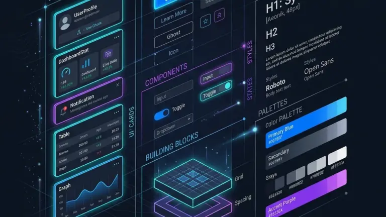
Build a Color System, Not a Color Palette
A mature SaaS design system doesn’t just define colors — it defines their context. Map every swatch to a purpose: primary (main CTAs), secondary (navigation, links), success (confirmations, trials), warning (notifications), surface (card backgrounds), and text (body, muted, inverted). When a new page or feature is built, the designer doesn’t ask “what color should this be?” — the system already answers.

0 Comments
Please log in to leave a comment.