The Hidden Conversion Engine of Every Landing Page
Most designers obsess over hero images, button colors, and layout grids — and overlook the element that does the most heavy lifting: typography. The right font pairing doesn’t just make your site pretty. It builds trust, guides attention, and directly impacts conversion rates. Here’s how to build a typographic stack that sells.
Start With the Body Font
Your body typeface should prioritize readability above all else. Sans-serif fonts like Inter, Source Sans 3, and Open Sans dominate SaaS landing pages for a reason: they render crisply at small sizes, maintain legibility across devices, and convey a modern, trustworthy feel. Stick to a single family for body copy to keep load times low — each additional font file adds weight to your page.
Set your base size with clamp() for fluid scaling. A starting point like clamp(1rem, 0.9rem + 0.3vw, 1.125rem) gives you 16px on mobile, scaling smoothly to 18px on desktop without a single media query. Pair this with a line height of at least 1.6 for body text to maintain comfortable reading flow.
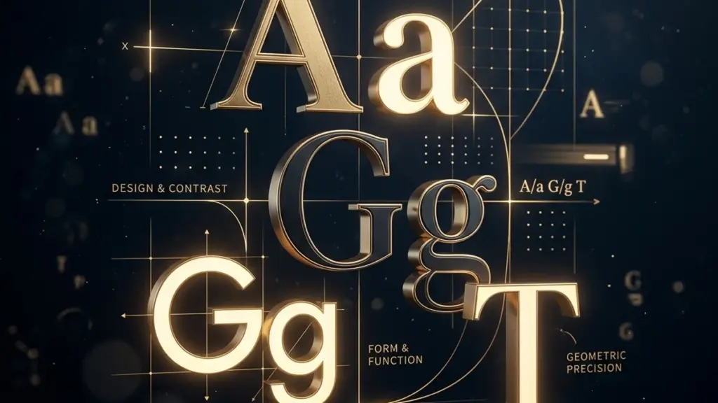
Choose a Heading Font That Contrasts Purposefully
The heading font should differ from the body font in weight, personality, or classification — not just size. A serif heading (like DM Serif Display or Playfair Display) paired with a sans-serif body creates instant visual hierarchy, guiding the eye to key sections without relying on aggressive spacing. Alternatively, a heavier weight from the same family works if you prefer a more unified look — just ensure the contrast is unmistakable.
For WordPress sites loading from Google Fonts, use the display=swap parameter to prevent invisible text during load. Even better, preconnect to the Google Fonts CDN in header.php to shave milliseconds off the initial request.
Build a Type Scale That Breathes
Every heading level from h1 to h4 deserves a defined size. Use a modular scale — try 1.25 (major third) or 1.333 (perfect fourth) — to generate sizes that feel mathematically cohesive. For example, with a 1.25 ratio and a base of 1rem, your headings become 1.25rem (h4), 1.56rem (h3), 1.95rem (h2), and 2.44rem (h1). This creates a natural rhythm that readers process subconsciously.
Set these as CSS custom properties at the :root level. When you need to adjust the entire scale later (seasonal redesign, rebranding, A/B testing), you change 6 variables instead of 50 hardcoded values.
The 60-30-10 Rule Still Applies
If 60% of your page is body text, 30% is headings, and 10% is callouts (captions, labels, legal), your type stack needs to serve all three. Test your pairings in context — write real copy, not lorem ipsum — and read it aloud. If your heading font fights your body font for attention, dial back the weight or switch to a quieter pairing.
A well-considered typography stack is invisible to the user but indispensable to the conversion funnel. Invest in it the same way you’d invest in load times or CTA placement.

0 Comments
Please log in to leave a comment.