Why Dark Mode Is a Design Challenge, Not a Color Swap
Flipping a white background to black and calling it dark mode is one of the biggest mistakes designers make. True dark mode requires a thoughtful approach to contrast, color adaptation, and user control. This guide walks through the essential principles for building a dark mode experience that feels native, not hacked.
Start With a Proper Color Palette
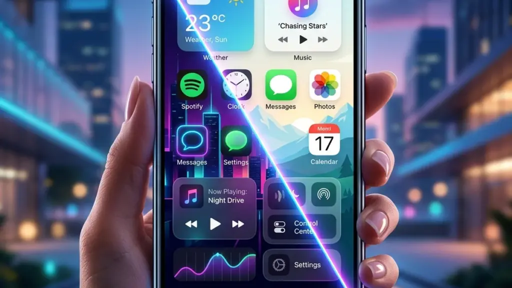
The foundation of any dark mode is a carefully selected palette. Pure black (#000000) should be avoided as a surface color because it creates harsh contrast and causes eye strain. Instead, use a dark gray like #121212 for the main surface, with elevation layers moving progressively lighter — #1E1E1E, #242424, and #2C2C2C. This layered approach mimics real-world shadows, giving depth without relying on heavy box shadows that disappear on dark backgrounds.
Your accent colors also need adjustment. A bright blue that looks great on white can feel blinding on dark. The Material Design guidelines recommend desaturating accent colors by roughly 30% for dark themes. Use hsl() or oklch() color functions in CSS to make these adjustments programmatic — you can shift lightness and chroma without rewriting every color declaration.
Contrast Ratios Work Differently
WCAG guidelines require a minimum contrast ratio of 4.5:1 for normal text. This becomes trickier in dark mode because light text on dark backgrounds requires different visual tuning than dark text on light. For body copy, aim for at least 15.8:1 on key reading surfaces. The CSS color-contrast() function is gaining browser support and can help enforce contrast automatically, but for now, manual testing with a tool like the WebAIM contrast checker is essential.
One common pitfall: muted grays that look readable to a developer on a high-end monitor may be illegible on a dimmed phone screen in sunlight. Test your interfaces at 50% brightness with Night Shift enabled.
Let Users Choose
Never force dark mode. The best implementation checks the user’s system preference with the prefers-color-scheme: dark media query as the default, then provides a manual toggle that persists in localStorage. This respects the user’s OS-level choice while giving an override for edge cases — like someone who prefers dark mode system-wide but wants your documentation site in light mode for readability.
For an accessibility win, also respect prefers-reduced-motion: reduce and skip the transition animation when swapping themes. A sudden, clean theme switch is better than a jarring fade for users sensitive to motion.
Dark Mode Is a System, Not a Feature
Done right, dark mode isn’t a checkbox feature — it’s a design system that touches color tokens, elevation, typography hierarchy, and interaction states. Treat it as a first-class visual language, build it into your CSS custom properties from day one, and your users will thank you with longer session times and lower bounce rates.

0 Comments
Please log in to leave a comment.